Look at the coat and bag together
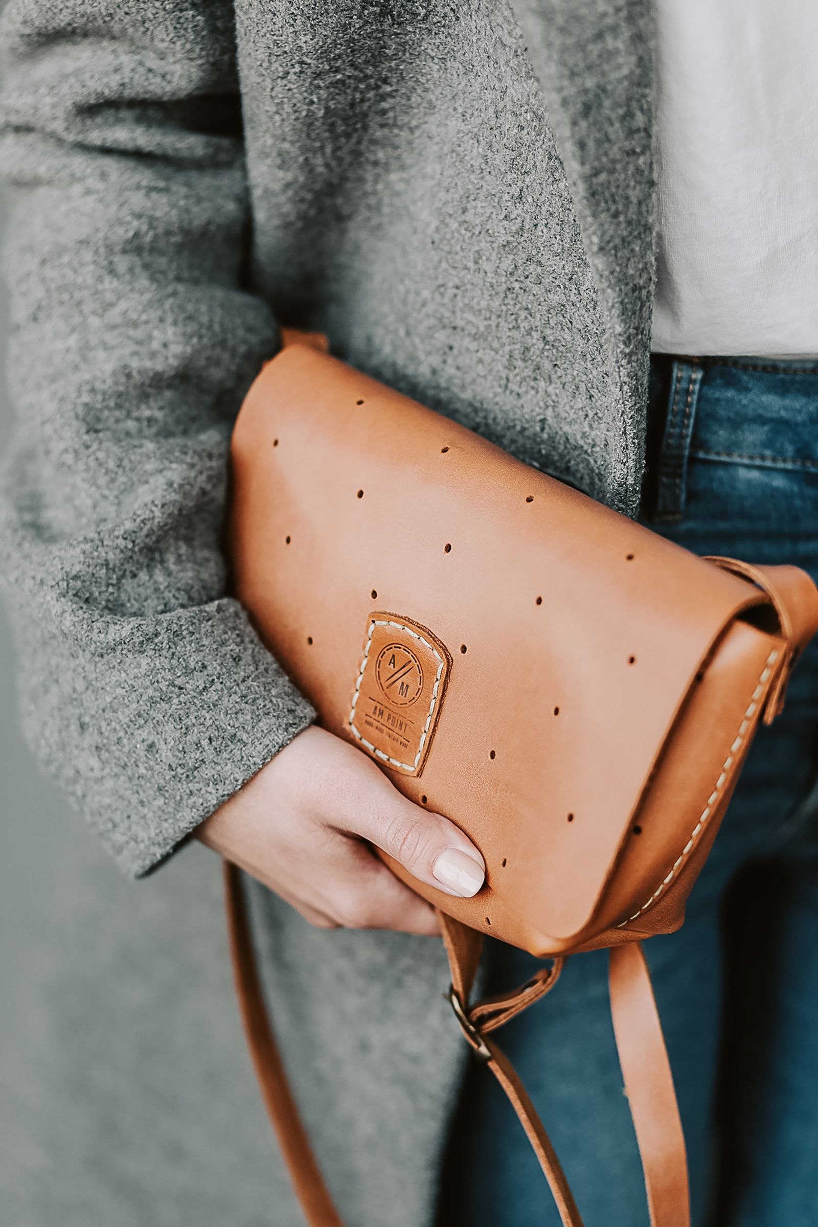
A handbag can appear subtle in a product image yet become the strongest color in an outfit when placed against a quiet coat. Compare the actual pieces in the ordinary carrying position. Notice the amount of bag visible and the contrast with the retained coat rather than judging two separate color swatches.
Color weight is a visual description, not a product specification. Do not infer material, quality or performance from the way the bag looks beside the coat. Keep those details tied to reliable product information and the actual use the outfit needs to support.
Choose whether the bag leads or connects
Decide whether the bag should serve as a deliberate accent or sit more quietly within the outfit. Either result can be enjoyable. A tan bag against a gray coat, for example, can create a visible contrast without requiring another matching object elsewhere.
Our accessory roles guide begins with a clear purpose. The visual role should sit alongside the practical one. A color that completes the outfit is less useful if the bag does not appropriately support its actual contents and carrying needs.
Include the handle and sleeve
Try the bag with the coat worn as intended. The handle, strap and sleeve relationship can affect the way the color appears and whether the carrying position is comfortable for the user. A bag held forward for a photograph may sit elsewhere through the day.
The handle and sleeve check examines that detail directly. Keep its practical result in the color comparison rather than preserving an appealing view through an awkward carrying arrangement.
Keep the rest of the outfit modest
Look at the retained shoes, scarf and other visible pieces. Decide whether another repeated color is actually useful or whether the coat and bag already provide a clear relationship. Adding several coordinated accessories can turn one enjoyable contrast into a more demanding outfit.
Compare the pieces in the ordinary light available rather than claiming an exact color match from a screen. Different materials and surfaces can read differently without making the outfit wrong. The aim is an intentional relationship, not identical appearance under every condition.
Use the decision across retained outfits
If the combination works, consider which other coats already owned give the bag another useful role. Keep the comparison grounded in those real pieces rather than an imagined future wardrobe. A versatile bag does not need to match every item to serve several days well.
What if the bag feels too prominent? Try another retained coat or a quieter suitable bag before adding more matching accents. What if the contrast is enjoyed? Leave it clear. A considered color relationship can let one accessory stand out while keeping the whole outfit practical and personal.
Published and updated June 12, 2023. Have a correction or a useful question? Contact the journal.