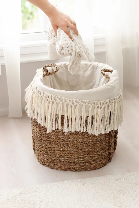
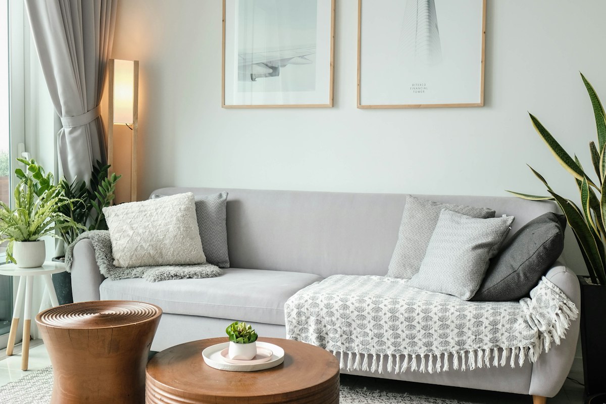
Bring the pale surfaces together
A wall, sofa and throw can each look white in isolation and noticeably different in the same room. Begin with the physical retained pieces rather than three separate product photographs. Include the largest pale surfaces first; they carry more visual weight than a small ornament.
Describe the relationship in ordinary words. One fabric may seem creamier or greyer beside another. That observation helps the decision without requiring a technical colour label or a claim that one of the products has the wrong shade.
Keep the comparison conditions steady
Look at the group in daylight from an ordinary room position. Do not move a fabric to a brighter window while leaving the other in shade and then treat the difference as a fair colour comparison. The surfaces need a shared setting before their relationship becomes clear.
Check again under the lamps normally used in the evening. The group may look warmer or less distinct then. Both views belong to the room's real appearance; there is no need to make them look identical to one carefully lit photograph.
Separate tone, texture and sheen
A glossy textile catches a highlight differently from a matte one, while a visible weave can create small shadows. Look at a broad ordinary area of each fabric instead of only a folded corner. What initially seems a colour disagreement may be a surface difference you actually enjoy.
Use physical samples where available and keep their exact identities clear. A phone image can change the warmth of the whole scene. It is useful for remembering the arrangement, but it cannot certify a precise match between pale materials.
Try a distinct retained contrast
If the near match continues to bother you, compare a clearly darker suitable textile rather than searching immediately for another almost-white. A deliberate boundary can make the variation feel more settled. Keep the sofa and wall unchanged so the effect is understandable.
Change only one optional piece at a time. If a lamp, cushion group and throw all change together, the room may improve without showing why. The useful result is a relationship you can describe and repeat, not an unexplained better photograph.
Keep the simplest complete group
Choose textiles for their actual role and care routine alongside appearance. A fabric that looks quiet still needs to suit everyday seating or its intended use. Do not apply an improvised treatment simply to make a pale shade resemble another product.
Save the physical pairing you prefer and one plain-language note about its difference. Warm whites can coexist through deliberate variation, and a room does not need exact matching on every surface. Once the retained group feels settled in ordinary light, leave enough space for its textures to remain visible instead of adding more accessories to prove that the colours belong together.
Related reading
Connect One Green Detail With the Living Room You Already Have, Arrange Sofa Cushions Around the Seats People Use.
Published and updated April 1, 2022. Have a correction or a useful question? Contact the journal.