Keep the retained surfaces visible
A kitchen wall colour is easier to judge beside the actual surfaces that will stay than against an isolated online swatch. Begin with the retained worktop, furniture or other prominent timber-looking detail. Identify the real visual reference instead of imagining a completely new kitchen around one proposed shade.
Keep material identity separate from appearance. A warm wood-like finish does not establish a particular construction, suitability or care method. Product and practical project questions still need their actual information.
Name the colour relationship
Describe what you want the wall to do beside the retained surface: remain quieter, create a clearer distinction or connect with another actual object in the room. A broad wish for warmth can cover several different visual outcomes. Keep the preference specific enough to compare.
There is no need for every tone to match exactly. A deliberate contrast may feel more coherent to you than an almost-match, while a quieter relationship can serve another room equally well. The decision belongs to the actual setting and person.
Use an appropriate local sample
Choose a suitable sample method through the product information and keep its exact identity clear. Compare it beside the retained reference in relevant ordinary light. A private photograph may preserve context but can alter subtle colour differences and reflections.
Record what the observation actually describes. A note naming the sample and particular worktop is more useful than saying the pale one looked better. If several similar options are considered, preserve their separate references rather than relying on memory of their order.
Include the complete kitchen view
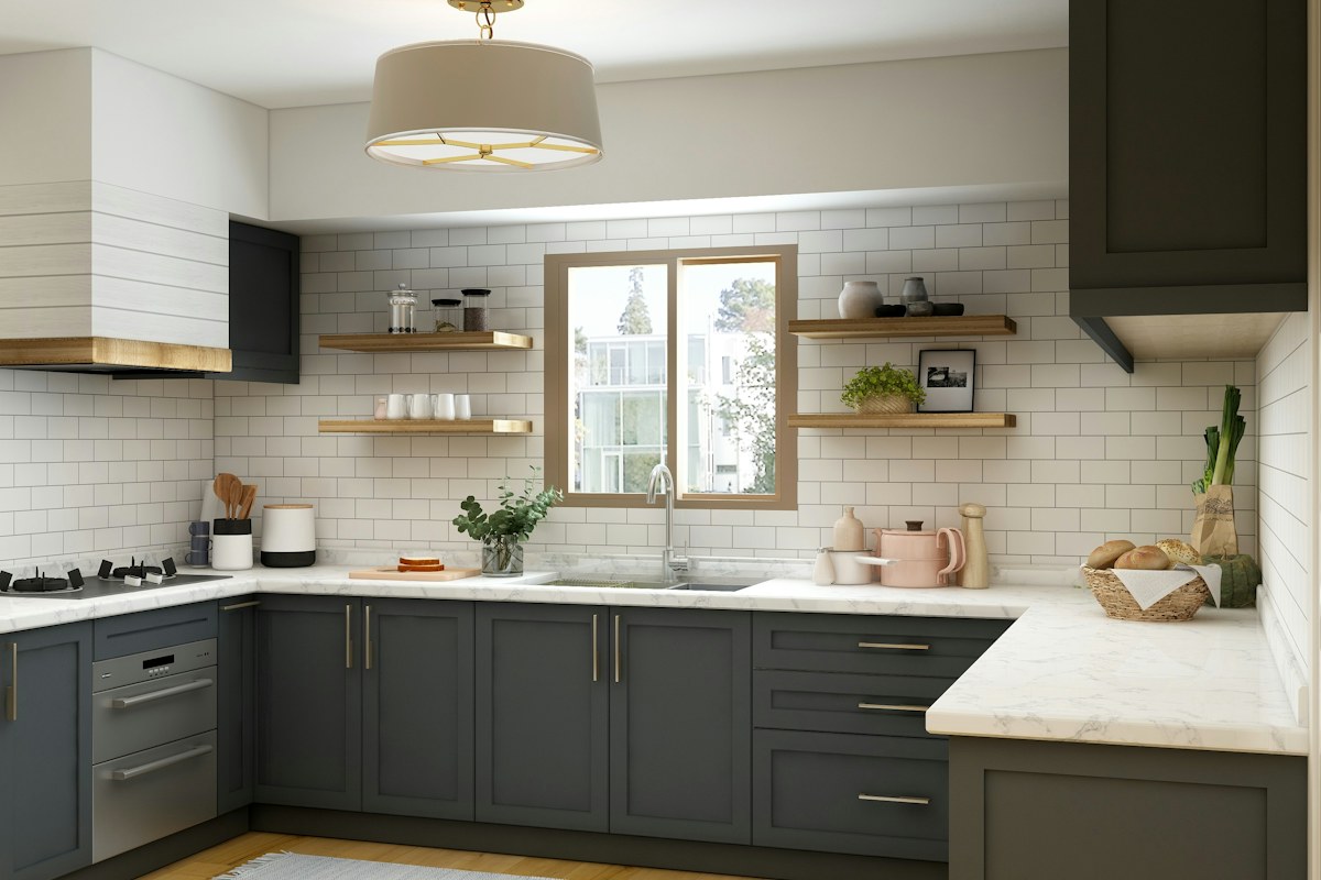
Look at the actual cabinet fronts, neighbouring wall and other prominent retained materials together. A shade that seems quiet beside one small surface can create a different relationship across the whole room. Keep the comparison bounded to the local question instead of replacing everything that does not match the sample.
Separate appearance from preparation, compatibility and application requirements. A pleasing colour does not establish that the proposed product suits the actual surface or method. Seek the relevant guidance and appropriate expertise where the real project needs it.
Close one useful decision
Choose the appropriate option that serves the actual room and preference, or identify the exact unresolved detail before gathering more alternatives. An expanding sample collection can make the original question less clear rather than more informed.
What if the retained timber-like tones differ? Compare the genuine group rather than forcing every object into one assumed category. What if the preferred sample has unsuitable practical requirements? Resolve those first. A considered wall comparison connects local light, retained surfaces and personal preference through one modest decision rather than a whole-room shopping formula.
Keep the exact product and colour reference if a change proceeds. A broad name such as warm white may not identify the option whose appearance and suitability were actually checked.
Related reading
Connect One Green Detail With the Living Room You Already Have, Keep Kitchen Conversation Clear of the Working Island.
Published and updated January 1, 2023. Have a correction or a useful question? Contact the journal.